Chrome Text Photoshop Tutorial
So you want to know how to make Chrome text in Photoshop? It is easy and I will show you how. First of all make a new image 600X600 with a black background with some white text on it, once you have the text the way you want it rasterize the layer (right click the text layer in the layers palette and choose Rasterize Layer). Then duplicate the text layer so you have two layers with the letters on it.

Control click on one of the layers with the letters to bring up its selection. Then go to your channels menu and save the selection as a new channel. Working on the newly created channel (Alpha 1) with the selection still active do a series of Gaussian blurs starting at 16 then 8,4,2 and finally one.
Now go back to your layers palette, working on the top layer go to your lightening effects (filters/render/lighting effects) I used the settings that you see below.
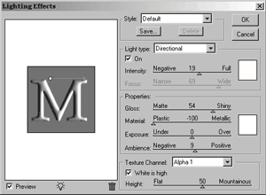
After the lightening effects your image will look like this. As you can see lighting effects is a great tool in Photoshop, thanks Adobe.

You will notice that after the lightening effects the image looks a little rough. We can fix that, just do a Gaussian blur of 2 pixels over it to smooth it out. You may not notice a difference here but trust me you will when you do it.

Still working on the top layer, we are going to adjust the curves to start to give the image its chrome look. Set your curves to the settings shown below.
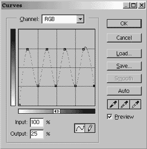
After you have adjusted your curves your image will look like the one below. Which looks pretty cool, but I like it better after the last step.

The last thing to do is add the plastic wrap. You can find the plastic wrap filter under filters/artistic/plastic wrap. Set all the levels to their maximum.That is all for this Photoshop tutorial folks. Any questions, comments or feedback fill out the form below.

Filed Under Tutorials | 49 Questions/Comments |
Comments & Questions
If you would like to make a comment, or ask me a question, please fill out the form below.
If you want a personalized image to appear with your comment you need a Gravatar.
Sign up for a Gravatar today. It's free and easy

November 6, 2009 8:44 AM
The second to last looks more chrome like and better than the last.
November 6, 2009 9:37 AM
Then don’t do the last step.
January 7, 2010 12:06 PM
Posted by: Moe
November 6, 2009 9:37 AM
Then don’t do the last step.
Word! xD
January 7, 2010 12:30 PM
Hi, First of all very nice tutorial. But I have a few questions about it.
“series of Gaussian blurs starting at 16 then 8,4,2 and finally one.” Am I suppose to do it on the Alpha layer that’s created from the new channel, or the cyan,m y b layers?
and the other thing is that I tried to do this, but when I was choosing the lighting effect on the text layer, cs4 woulden’t le me use it. do you know what the problem is?
January 7, 2010 2:23 PM
You do the series of blurs on the newly created Alpha channel.
You probably have to rasterize the text layer in order to modify it. Just right click the text layer and choose Rasterize.
January 8, 2010 12:51 PM
I am struggling with this, I don’t understand why you duplicate the layer. Then you say “click on one of the layers” and then “working on the top layer” are we talking about the same layer?
And when I do the several Gaussian blurs that’s fine! but the second I go back to a layer it changes from the custom channel containing the blur to default channels, should I delete the default channels or is it supposed to switch back?
Basically after going through all the steps I end up with a fairly dull zebra type font that doesn’t look as shiny chrome as the above font!
January 8, 2010 1:24 PM
You duplicate the layer because the unaltered letter beneath the altered letter helps in the end result.
I don’t say “click on one of the layers” I say “Control click on one of the layers”, big difference. It doesn’t matter which one you click because the two layers will be identical at that point in time.
When you switch back to your layers palette it should hide the blurred channel. You use the blurred channel as texture channel when you use the Lighting effects filter.
I suggest you do the tutorial again making sure that you are following each step exactly.
January 9, 2010 12:35 PM
I understood the difference between control click and click, my problem was not knowing whether both layers needed editing but you answered that by saying one of them remains unaltered. Thanks!
My main problem was I was using a much bigger Impact font and the Gaussian blurring wasn’t deep enough! So I started at 64px and worked down to 1px, I think it worked out pretty good, you also need to mess around more with the curves but the preview lets you see when you are good!
I tried the same technique on 3D text aswell andI think I did ok for a beginner 😛 Don’t know if I can post a link on here but here goes image
Thanks Moe!
January 19, 2010 8:55 PM
Hi,
I went through this tutorial three times after excitedly discovering someone had mastered the chrome finish.
still no luck. i am clearly doing basic something wrong because after the lighting effect, it looked nothing like the pic with no raised form at all. i have been playing around inner and outer glows, bevels etc and got a reasonable semblance, but not as goo as the text above. I am lost somewhere between the Gaussian blur and the lighting effect… any more detail would be greatly appreciated.
January 19, 2010 11:55 PM
If you aren’t getting the 3D look after the lighting effect I’d be willing to be that you aren’t setting the Texture Channel to Alpha 1 and/or “White is high” is not checked.
January 20, 2010 3:28 PM
Thanks for the tip. I went through the process again from the start an was vigilant about following the instructions. I am sure there is some fundamental thing i am not doing as it doesn’t look at all like your reference even after applying the lighting effects. Double checked all of the settings. Still no luck. I apologise for seeming unable to follow directions!! Does the image visibly change with the Gaussian blur? or is it only with the additional lighting changes?
January 20, 2010 3:37 PM
….also meant to ask whether the chrome effect is possible with no background? I was aiming to have a chrome logo that could exist on website over a background with different colours.
January 20, 2010 3:52 PM
Hi Rex,
Are you working on large text? If so you need to give the custom channel more gaussian blur! Try starting at 64px and keep repeating the gaussian blur with half as many px each time till you get to 1px!
Then make sure this new custom channel, with the gaussian blur, is used when you are doing the lighting effects part! And yes, you should see a visible difference when you switch to the custom channel from default! If this isn’t the case it is probably the custom channel that is at fault. For me, it was the amount of gaussian blur that I was doing wrong at first try giving it more pixels!
The background isn’t important in chroming, you can easily make it a transparent background.
January 20, 2010 4:20 PM
The image will visibly change after both steps. After you apply the Gaussian blur the image will be blurred (duh) 🙂 but you will only see this change on the channels palette, not in the layers palette and it will change when you apply the lighting giving it the 3D look.
Can you post the image that you are ending up with?
I believe you can change the background color with no issues, but I wouldn’t swear to it. You can always delete the black behind the letter when you are done with the tutorial.
January 20, 2010 4:21 PM
thanks Kris for the input. I am clearly a Photoshop luddite, still not doing the trick. started with blur on 64 and 128 and worked my way down.. also with black background and transparent. the text [in Broadway TL] does not seem to visibly alter throughout the blurring process, and then when i include the lighting effects, it simply turns the text from ‘flat’ white to black.
I am leaving something out that is obvious, except I am not sure what it is. are there any specific colour settings at the start that I should be aware of?
I appreciate the collective coaching. I feel there is an ‘ah-hah’ moment imminent……
January 20, 2010 4:32 PM
what’s the best way to post the output? I have seen some slight change to the text in the middle letter providing some slight amount of texture. perhaps i’ll try with one letter and see whether it provides and better result.
January 20, 2010 4:35 PM
After blurring the text in the channels palette it should look something like this.
This effect may not work with all fonts, try doing it with a font similar to the one I used in this tutorial, I believe it’s “Arabic”
Yes, you will have much better luck doing this one letter at a time.
January 21, 2010 7:43 PM
Hi Moe,
what’s the best way to post images back on your blog? i can show you what I have done so far just playing around with ‘Effects’ and the results from my attempt here.
January 21, 2010 11:26 PM
Just put the image somewhere on the net, there are tons of free image hosting places out there like imageshack, and then put a link to it here.
February 24, 2010 6:29 PM
could you clarify what you mean by control click to bring up its selection at the beginning, because i tried control clicking and saying select pixels but that didn’t end up working
February 24, 2010 6:45 PM
I mean holding down the control button on your keyboard (on a PC I think it’s command on a Mac) and while holding it down clicking the layer in your layers palette. Depending on the version of PS you are using you may have to click the Layers thumbnail in the layer palette.
February 25, 2010 8:10 PM
I had the same problem ‘Rex’ had. Flat letter with no bevel. Don’t know if you’ve already solved the problem but I found that when I went to the lighting effect, I had to choose ‘M copy Transparency’ as the texture channel instead of Alpha 1. Of course, ‘M copy’ was the name of my layer. Hope this helps. Once I found this out (after many attempts) I really liked this tutorial. Thanks for posting
June 28, 2010 2:26 PM
I finally figured out why the instructions did not yield the expected result: In CS4, the “CNTL + Click” does not select the pixels. I had to use the Magic Wand tool to do so. Not elegant, but it works.
MOST IMPORTANT, though, is that one has to change the direction/intensity of the light to match that in the figure’s lighting effects diagram (by moving/dragging the small, white circle and the line inside the diagram). This is not reflected in the numerical settings (no pun intended); however, if you look closely at the figure, you’ll see that the circle starts just to the right of the top of the first descender of the “M,” and the end of the line stops just at the right of the second descender.
This makes all the different in the world, and I believe that this instruction (more elegantly described) should be added to the the tutorial.
June 28, 2010 2:56 PM
CTRL + Click still selects the pixels in CS4, I do it all the time, just make sure you click the thumbnail in the layers palette.
Not sure why you had so much trouble with the lighting effects I state in the tutorial “I used the settings that you see below.” and then post a picture of the settings I used, to me that seems pretty self explanatory.
Anyway, I am glad you got the tutorial to work for you.
Cheers
June 29, 2010 6:19 AM
Hi, Moe. I can explain why posting an image of your settings is leading to confusion: the image is small, especially when printed out (smaller than a postage stamp), and the lighting effect diagram is gray upon gray, making it even more difficult to see that there is anything to be changed in the diagram.
Also, I think of “settings” as what is entered into the boxes (rightly or wrongly) and thought that by entering the numerical information that I would achieve the desired result.
Simply noting in your written directions that the direction of the light must be changed by dragging the circle/line to match the figure’s configuration would be sufficient, but an external, enlarged image would be even better — like the one you use for the blurred text in the channels palette.
Thanks for sharing your good work!
August 3, 2010 8:20 PM
Hey Moe…
Thanks a lot…that’s the most effective tut I’ve looked at so far on chrome text…appreciate it muchly. I must say I don’t get it when people try to tell the teacher that the teacher is wrong when they are the ones who don’t follow instructions…and the comment on “CS4 can’t make a selection with ctrl-click” on the layers menu suggests that someone needs to do some practical tutorials before they try to look like a photoshop star creating chrome…there’s no glamor without a basic foundation…but then again, that’s why we have rap “music”, isn’t it?:) Sounds to me like some people also ought to practice drawing and painting as well…computer drawing programs aren’t a replacement for artistic disciplines…they are additional tools.
Thanks again for your patience
August 31, 2010 5:24 AM
I’m trying to make a chrome text effect as tutorial says, but I get to the stage “Now go back to your layers palette, working on the top layer go to your lightening effects “(filters/render/lighting effects) . This menu Lightning effects is not activated, I cannot select it. Do you know why? I really need some help!!!! It’s so frustrating.
Thanks
August 31, 2010 10:44 AM
Laree Peterkin,
What version of Photoshop are you using?
September 1, 2010 11:16 PM
I’m using Photoshop CS3 version 10.
I’ve tried heaps to do this and get nowhere.
I need one word, anyone want to do it?????
This effect is making me crazy.
September 2, 2010 11:21 AM
I bet you didn’t rasterize the text.
September 4, 2010 2:04 AM
I’ve started again and still can’t get the “lightning effect” activated. I rasterized the text and rasterized the later.
Any clues!
Thanks
September 8, 2010 12:50 PM
Excellent post! Thanks alot. I was searching for this. Thanks Moe
/Tina
October 21, 2010 6:05 AM
great effect
November 3, 2010 5:01 PM
@Laree
Really late suggestion but are you in CMYK mode? A lot of options get shut off in later versions of PS.
November 11, 2010 8:07 AM
Following chrome text tutorial. The lighting effects (step2) is unavailable under filters>render, (it’s grey on menu). I rasterized type. How do I enable lighting effect?
Thnx …ronaldo
November 17, 2010 11:13 AM
Ronaldo, what version of PS are you using?
February 7, 2011 4:30 PM
This tutorial is brutal. Jesus, how much more vague can you be.
February 7, 2011 6:01 PM
I could be much much more vague if I wanted to be. If you are having a specific problem with the tutorial I’d try and help. But if you’re going to be a dick about it I won’t bother.
March 3, 2011 8:56 AM
Hi, I appreciate this tutorial, but I don’t understand your statement “Working on the newly created channel (Alpha 1) with the selection still active do a series of Gaussian blurs starting at 16 then 8,4,2 and finally one” I can get to channels Alpha 1, but the selection just looks black. Could you please explain more precisely?
Thanks
April 27, 2011 5:25 AM
Thanks for this tip. Trying to recreate my gaussian blurs seem to be blurring into the black background rather than the white text ie the hard outline of text is softening into the background…
Do you have any suggestions?
May 5, 2011 10:33 PM
this tutorial isnt very good for the beginner. there are steps in between each of the steps which will lose the average user. just saying.
August 24, 2011 3:28 AM
How texts work and Aerov three-dimensional color gold and chrome on Photoshop
October 31, 2012 1:40 AM
I’ve done chrome before but now my computer won’t let me do all the steps and its driving me CRAZY!!! I can’t access either the lightening tool or the plastic wrap… any ideas why?
October 31, 2012 12:53 PM
Angela, are you running a full version of Photoshop? Sounds like maybe you’re running Photoshop elements or something.
October 31, 2012 8:38 PM
definitly running full version CS4. Whats annoying is I’ve done chrome before and it looked awesome… now I can’t access those tools, driving me nuts!
November 1, 2012 12:23 PM
Angela, is your image mode set to index instead of RGB? At the top of the screen Image/Mode/RGB.
April 14, 2013 3:53 PM
Hey Moe, over the years I have tried many other tutorials on creating realistic chrome text. Yours is BY FAR the best one out there. So good in fact, I expected to never need another technique ever again. Then Adobe made a change to PS, putting me on full tilt! The CS6 version of PhotoShop has a different “Lighting Effects” engine than CS4, although it looks like it’s almost identical. The three types of light in CS6 are: Point, Spot, and Infinite. In CS4 they were: Directional, Spotlight, and Omni. I was hoping these were merely label changes and did not represent a change in functionality. If I follow all of the steps of the tutorial exactly the same between both versions of PS, and select “Point” in CS6 as the new “Directional” in CS4 I get very, VERY different results. In CS4, with the Alpha channel selected as the Texture, each letter was affected by the light independently like it had its own dedicated light, which created the beautiful contoured dark edges. In CS6 the lighting is affecting the whole paragraph creating a swath of light over the letters in the “beam” and fading out over those outside the beam. This completely destroys the beautiful effect in CS4. I am hoping you have observed the same issue and have an easy way to get the same results in CS6 that was possible in CS4. I’m not a PS expert, so the only low-brow technique I can think of is to create one light for each letter – UGH, what a horrible nightmare! Or maybe a white-to-black gradient on the text with some tweaks to the masking might get close??? Maybe there’s a lighting plug-in for CS6 that simulates the lighting engine in CS4, if one even exists?? Or will I be keeping a copy of CS4 installed for years, just to get the awesome chrome text when I want it! Ha! Please let me know what you know, and thanks again as the process is still brilliant!
Cheers,
– DK
April 15, 2013 10:32 AM
Sorry, I am using CS5 still. I have no immediate plans to upgrade to CS6 so I am afraid I can’t offer you any advice.
November 15, 2013 3:10 AM
Hi Moe
I’m struggling with the curves step, i’m using cs5 and the curves form is a little bit different from the one you used. Can you maybe give me a step by step direction on how to get the curves settings like that please?
Kind regards from South Africa
Lisa